Data Storytelling and Data Visualisation
Designed to supercharge your analytical skills, this course helps you master the art of communicating data in a way that’s clear, compelling, and impossible to ignore. You’ll explore the core principles of data storytelling while getting hands-on with powerful visualization tools to bring your financial data to life.
Data Storytelling and Data Visualisation Course
$0.00 ($1,264.40 bef. Subsidy)
-$812.00 (WSQ Subsidy)*
-$452.40 (SFC Credits)*
*This is a projected amount, should you qualify for these.
E-Learning via Zoom
2 Days, 9am to 5:30pm

Looking for 90% Subsidy?
View Corporate Training
Why Choose Data Storytelling and Data Visualisation?
Learning Data Storytelling and Data Visualization is a powerful way to turn complex data into clear, engaging insights that drive action. It helps you communicate more effectively with stakeholders, create impactful reports, and support smarter decision-making. In today’s data-driven world, it’s not just about having data—it’s about making it speak with clarity and purpose.
2-Day E-Learning via Zoom
Course ID: TGS-2025053855
Who is This Course For?


*Learners need to possess basic information and communication technology (ICT) skills. There are no *pre-requisites for professionals who would like to pursue the certification course.
Core Competencies You'll Gain:
Analyze data to uncover insights
Compare patterns for storyboarding
Review tools for business use
Evaluate visuals to highlight trends
Create dashboards with analytics features
Refine presentations for stakeholders
Design storyboards to present insights
Data Storytelling and Data Visualisation Course Details
Our Data Storytelling and Data Visualization Course is designed for individuals looking to master essential, practical skills in turning complex data into clear, compelling visual insights. As the demand for data-savvy professionals continues to rise, this course offers hands-on training in storytelling frameworks and powerful visualization tools. Ideal for professionals considering a career shift, those wanting to enhance their current analytical capabilities, or anyone aiming to communicate data more effectively, this course empowers learners to unlock new opportunities in business, marketing, finance, and beyond.
Synchronous
E-Learning via Zoom
2 Days,
9.00am to 5.30pm

Course Fee & Subsidies
Singaporeans aged
40 and above
Course Fee
$1,264.40
70% WSQ Subsidy
-$812.00
SFC Credits
-$452.40
Amount to Pay
$0
Singaporeans aged
below 40
Course Fee
$1,264.40
50% WSQ Subsidy
-$580.00
SFC Credits
-$684.40
Amount to Pay
$0
Permanent
Residents
Course Fee
$1,264.40
50% WSQ Subsidy
-$580.00
Amount to Pay
$684.40
*Please note that a $20 non-refundable and non-claimable registration fee applies for all course registrations
*Prices quoted are inclusive of GST at the prevailing rate
SkillsFuture Credits: All Singaporeans aged 25 years old and above can use their SkillsFuture Credits to fully offset the remaining fees.
Course Dates for Data Storytelling and Data Visualisation
No schedule dates available for this course.
Meet Your Trainers

Goh Cheng Hau, Gary
Gary is a seasoned data analyst with extensive experience working in leading software and biotechnology companies. As a CPE-Registered adjunct lecturer, he has taught and examined diploma to postgraduate courses across multiple private education institutions. Gary holds an MBA in Finance, a BSc in Finance, and a Specialist Diploma in Big Data Analytics. His professional certifications include the Microsoft Professional Program for Data Science and the Advanced Certificate in Training and Assessment (ACTA).

Dwight Nuwan Fonseka
With over 20 years of expertise at the intersection of technology, data science, and education, Dwight Nuwan Fonseka is a leading expert in Business Intelligence, AI, and Data Analytics. His unique multidisciplinary background, holding a degree in Biotechnology from NUS and a Master’s in Education from NTU, enables him to bridge the gap between cutting-edge technology and practical business applications.
Data Storytelling and Data Visualisation Course Outline
- Data exploration techniques
- Time series analysis
- Correlation analysis
- Outlier detection
- Pattern recognition methods
- Trend identification
- Seasonality analysis
- Cluster analysis
- Statistical analysis fundamentals
- Descriptive statistics
- Distribution analysis
- Hypothesis testing basics
- Portraying Data Patterns, Trends, and Correlations
- Comparison Techniques: Bar charts, line graphs, heatmaps
- Relationship Diagrams: Network diagrams, flowcharts, Sankey diagrams
- Distribution Displays: Histograms, box plots, scatter plots
- Linking Data Insights to Visuals
- Identifying critical insights
- Choosing data points for visuals
- Organizing insights for clarity
- Exploring Visualisation Tools
- PowerBI
- Google Charts
- Tableau
- Exploring Visualization Technique
- Sankey diagrams for flow analysis
- Network graphs for relationship mapping
- Treemaps for hierarchical data
- Strategic mapping techniques
- Geographic information visualization
- Process flow visualization
- Organizational structure mapping
- Business alignment strategies
- KPI visualization hierarchies
- Strategic goal dashboards
- Performance scorecards
- Display optimization techniques
- Color theory application
- Typography guidelines
- Layout principles
- Visual impact enhancement
- Contrast and emphasis
- Gestalt principles
- Visual hierarchy
- Data presentation best practices
- Chart selection guidelines
- Data-ink ratio optimization
- Visual clutter reduction
- Showcasing what constitutes an effective dashboard and scorecard
- Dashboard creation tools
- Tableau dashboard layout principles
- Filter and slicer implementation
- Cross-filtering and drill-through setup
- Integration of interactive elements
- Click-through actions
- Tooltip customization
- Parameter controls
- Performance optimization for dashboards/ scorecards
- Calculated fields
- Statistical measures (moving averages, forecasts)
- Custom measures and KPIs
- Stakeholder requirements analysis
- Executive summary dashboards
- Operational metrics views
- Department-specific KPIs
- Data presentation validation methods
- Feedback collection methods
- Performance benchmarking
- Iteration and refinement processes
- Version control
- Change documentation
- User feedback integration
- Storyboard development
- Story arc frameworks
- Context-driven narrative structures
- Key message sequencing
- Framework creation
- Problem-solution frameworks
- Data story templates
- Decision flow structures
- Context alignment
- Audience context mapping
- Business scenario analysis
- Stakeholders need identification
- Organizational visualization standards
- Corporate visual style guides
- Branding-aligned chart templates
- Standard visualization patterns
- Strategic alignment guidelines
- KPI visualization standards
- Goal-aligned reporting templates
- Strategic metric frameworks
- Best practice documentation
- Visualization selection guides
- Implementation playbooks
Course materials will be provided in soft copy (digital format) as part of our eco-friendly and sustainability effort. Printed hard copies are available upon request. For any special requests (e.g., printed materials or accessibility needs), please inform us in advance.
Check Out Other Popular Courses
3 Easy Steps to Enroll
1
choose desired
course schedule
Choose convenient classes on evenings or weekends.
2
subsidy
Calculation
Fill out the form to calculate your government subsidies.
3
register
Online
Secure your place with a deposit and start today.
achieve mastery in Data Storytelling and Data Visualisation today


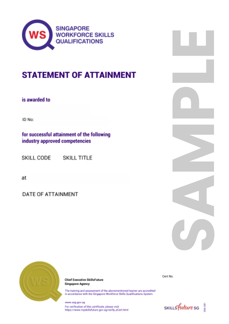
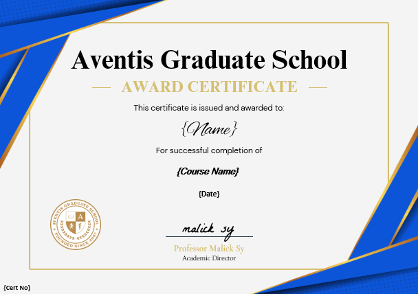
Upon successfully completing the Data Storytelling and Data Visualisation course at Aventis Graduate School, you will receive a WSQ Statement of Attainment recognized by employers in Singapore. This certification serves as a testament to your expertise in digital assets, helping you showcase your skills to potential employers and professional networks.
Bonus Tip: Display your certification on LinkedIn to strengthen your professional profile and capture the attention of potential employers.
FAQ
Data storytelling is the art of turning complex data into clear, engaging narratives using analysis, visuals, and context. It helps audiences understand not just what the data shows, but why it matters—making insights more memorable and actionable. Widely used across industries, it drives decisions, communicates performance, and influences stakeholders effectively.
Data visualization is the practice of turning raw data into visual formats like charts and graphs, making patterns and insights easier to understand. It helps users quickly interpret complex information, identify trends, and make informed decisions. Widely used in business and research, it enhances communication and brings data to life.
Yes, up to 70% funding support is available from The Institute of Banking & Finance (IBF) for our IBF-accredited programmes:
The IBF Standards Training Scheme ("IBF-STS") offers funding for training and assessment programmes accredited under the Skills Framework for Financial Services.
Eligible Singaporeans and PRs enrolled in our IBF-accredited courses can receive funding support through IBF-STS, subject to fulfilling all eligibility requirements.Yes. For self-sponsored Singaporeans aged 25 years old and above, you can use your SkillsFuture Credit to offset the remaining course fees after WSQ funding.
To check your SkillsFuture credit balance, please follow these steps:
- Go to https://myskillsfuture.gov.sg
- Click on ‘Submit SkillsFuture Credit Claims’
- Login with your SingPass
- Click on the arrow (>) at the top right hand corner. You will be able to see a drop-down list of your Available SkillsFuture Credits.
After you have registered for a course, an Aventis representative will reach out to guide you with the SkillsFuture Credits
*Please note that our courses are not eligible for “Additional SkillsFuture Credit (Mid-Career Support)’. You will only be able to use available credits from ‘SkillsFuture Credit’ and ‘One-off SkillsFuture Credit Top-Up’.The IBF funding support works on a nett fee model. This means that the subsidy is applied upfront, and you will only need to pay the balance course fees after the subsidy. For example, if you are eligible for 70% subsidy, you only need to pay the remaining 30% upfront.
To be eligible, you’ll have to meet the following prerequisites.
For Self-Sponsored:
All Singaporeans or Singapore Permanent Residents (PRs) that are physically based in Singapore and successfully complete the course will be eligible.
- Be a Singaporean Citizen or PR based in Singapore
- Minimum of 75% attendance (this means that you must attend at least 6 out of 7 lessons)
- Pass the final assessment
Any balance course fees can be offset using your SkillsFuture Credits & NTUC UTAP funding.
For Company-Sponsored:
- Be from Financial Institutions that are regulated by the Monetary Authority of Singapore (MAS) (either licensed / exempted from licensing) or Fintech companies that are registered with the Singapore Fintech Association.
- Be a Singaporean Citizen or PR physically based in Singapore
- Minimum of 75% attendance (this means that you must attend at least 6 out of 7 lessons)
- Pass the final assessment
A laptop is required for this course. No special software or other hardware is required for this course participation.
 Supercharge Your Career with Generative AI & ChatGPT!
